Posted on

Top Materials for Long-Lasting Labels

A label’s job isn’t just to look good—it’s to stay put and stay legible, even when the going gets tough. For many businesses, a label’s durability can mean the difference between smooth operations and costly mishaps. Let’s explore why durability matters and which materials have the staying power your business needs.

Materials Built to Endure:

  • Vinyl: The MVP of tough labels. Waterproof, UV-resistant, and capable of enduring extreme temperatures, vinyl labels are perfect for industrial use or shipping.
  • Polyester: Combines strength with a clean finish, making it a go-to for durable labels that still look sharp.
  • Specialty Adhesives: Don’t forget the stickiness factor! Durable materials need equally reliable adhesives to keep them in place.

Real-Life Scenarios:

  • Shipping and Logistics: Ensure your packages arrive with scannable barcodes, no matter the weather.
  • Manufacturing: Equipment labels that endure wear and tear save you the hassle of replacements.
  • Retail: Labels that stay vibrant and intact maintain your brand’s image on the shelf.

Tips for Maximizing Durability:

  1. Opt for laminated finishes to protect your label from scratches and smudges.
  2. Test for adhesion on your packaging material to prevent peeling.
  3. Invest in quality materials upfront to save on costly reprints or replacements later.

Durability isn’t just about labels that last—it’s about creating a lasting impression of quality and reliability for your business.

Posted on

First Impressions Count: How Label Design Impacts Your Brand

Think of a label as your product’s handshake with the customer. Before they even try your product, they see your label—and that first impression matters. A well-designed label isn’t just about aesthetics; it’s about telling your story and building trust. Here’s how to make sure your label design does your brand justice.

Material Matters:

  • White Gloss: Delivers vibrant, high-quality prints that demand attention. Ideal for colorful designs.
  • Clear Poly (BOPP): For a minimalist, modern look that blends seamlessly with transparent packaging.
  • Silver Poly (BOPP): Adds an eye-catching metallic effect that exudes luxury.
  • Estate 9: A textured paper choice for brands that value tradition and sophistication.

Tips for an Effective Label Design:

  1. Color and Contrast: Choose colors that align with your brand and make key information pop. High contrast ensures readability.
  2. Typography: Clear, professional fonts convey trust and make your label easy to read.
  3. Material and Finish: Match the label’s look to your brand’s personality. A glossy finish exudes luxury, while a matte finish feels grounded and natural.
  4. Function Meets Form: Don’t sacrifice functionality for beauty. Ensure your design fits the material’s durability needs.
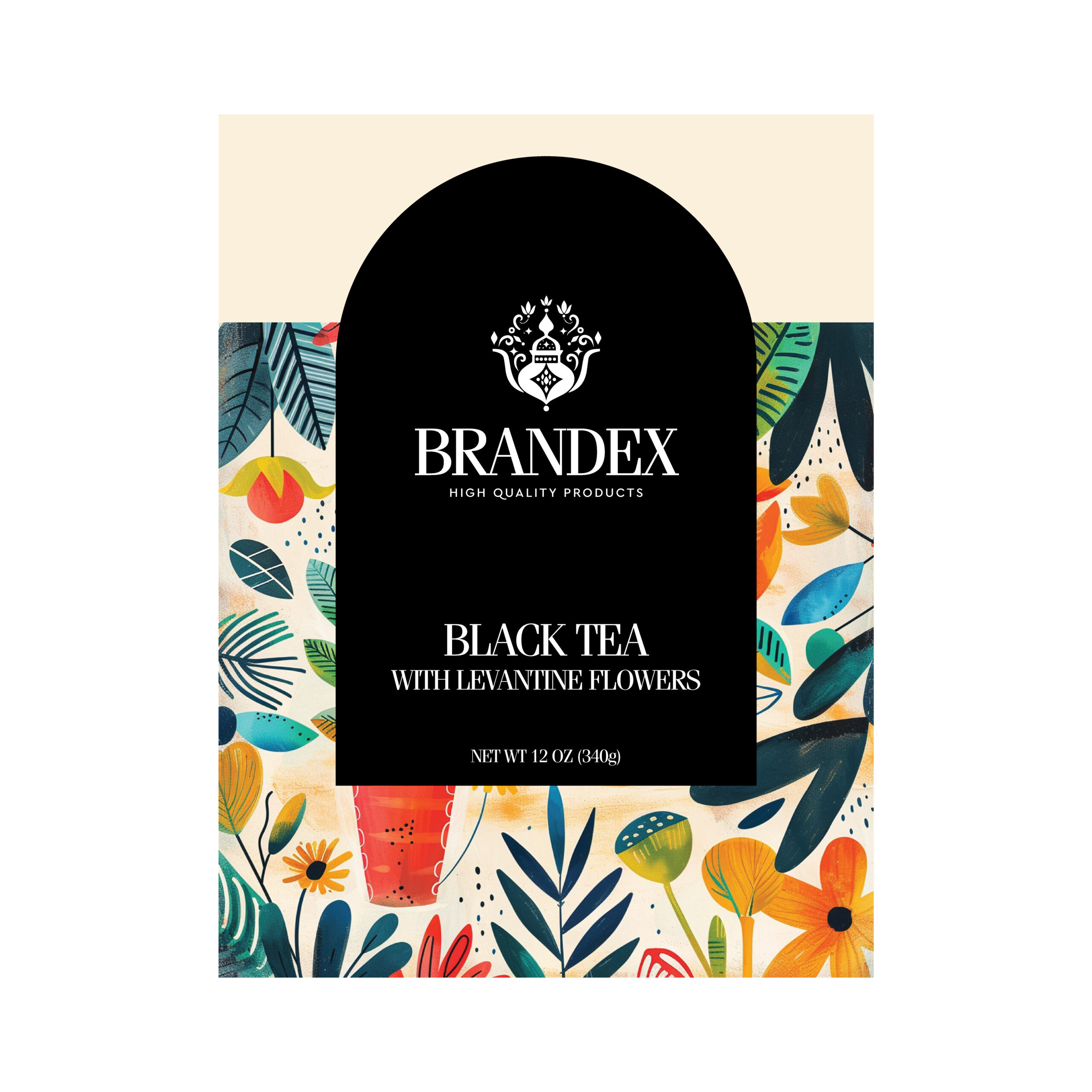
  5. Real-Life Example: A luxury skincare brand might choose Silver Poly with gloss lamination for an upscale feel. An artisanal jam producer could opt for Estate 9 with a matte finish for a rustic, premium vibe.

Your label isn’t just a sticker; it’s a story.

Choose materials and designs that reflect the quality and personality of your brand to make every impression count.

Posted on

3 Steps to Designing Labels That Actually Get Noticed

tips & tools

3 Steps to Designing Labels That Actually Get Noticed

In a crowded marketplace, your labels do more than just identify your product—they make or break a customer’s decision to buy. A well-designed label grabs attention, conveys your brand’s identity, and ultimately influences sales. But how do you ensure your labels stand out?

We’ve put together a simple, actionable guide to help you create labels that truly make an impact. Here are three key steps to designing labels that get noticed.

1. Choose Colors & Materials That Make an Impression

Synergestic actionables. Organic growth deep dive but circle back or but what’s the real problem we’re trying to solve here?

Understand Color Psychology – Bold reds create urgency, calming blues inspire trust, and bright yellows bring energy. Choose colors that align with your brand message.

Contrast is Key – High-contrast designs help your labels pop off the shelf. Think bold backgrounds with crisp, readable text.

Consider Specialty Materials – Metallic foils, clear labels, textured papers, or holographic finishes add a premium feel and make your product look high-end.

2. Design for Maximum Visibility & Impact

A label should be eye-catching from a distance and informative up close. Achieve this balance with:

Whitespace is Your Friend – Don’t overcrowd your design. Strategic use of whitespace keeps your label from looking cluttered and helps key elements stand out.

Clean, Legible Typography – Avoid overly decorative fonts that can be hard to read. Instead, use strong, simple typography with a hierarchy that guides the eye.

Unique Shapes & Layouts – A standard rectangle works, but die-cut labels in custom shapes (like circles, ovals, or product-specific contours) add instant visual appeal.

3. Make Your Labels Sell More

Your label isn’t just a design—it’s a sales tool. Optimize it for conversions with these pro tips:

Highlight Key Benefits – Instead of just listing ingredients or features, communicate what makes your product different. Does it have all-natural ingredients? Is it locally sourced? Call it out!

Use a Strong Call-to-Action (CTA) – Encourage customers to engage with your brand. A simple phrase like “Try it today!” or a QR code leading to exclusive content can drive more sales.

Test & Optimize – A/B test different label designs in small batches to see which ones perform best in real retail environments.

Great labels don’t just blend in—they command attention. With the right colors, thoughtful design, and strategic sales elements, your product can stand out and sell more. Get started today with our free guide and take your labels to the next level!